How can thinking like an artist help you with UI?
By Sofia M.
- 16 minutes read - 3237 wordsIntroduction
If some of you have studied art academically, whether it’s through art school or a university degree, you may know that most art disciplines are grouped into three main areas: drawing, where students learn to work with tone and shading; fine art, where we focus on color theory; and finally, composition, which is what we’ll focus on today.
So, what exactly is composition?
I believe it’s the most complex and crucial discipline in art. It’s not just about how skilled you are in shading or how masterfully you apply paint. Composition is about how you think and how you guide the viewer’s eye through your work.
The key concept here is integrity — everything must work as one. When the composition is strong, the design feels unified and intentional.
Chapter 1 - Balance
Balance in composition is about distributing visual weight in a way that feels harmonious to the viewer. For example, if you place a large object on one side of an image, the viewer will instinctively feel the need to balance it with something on the other side. Adding a smaller element on the opposite side achieves equilibrium without losing focus on the primary subject. The composition feels balanced, yet dynamic.
This concept translates perfectly into web design. Imagine a webpage where all the heavy visual elements (like large images or bold text) are clustered on one side—it would feel imbalanced, and the user experience would suffer. But by distributing these elements more evenly across the page, we can guide the user’s eye naturally, ensuring a smoother navigation experience.
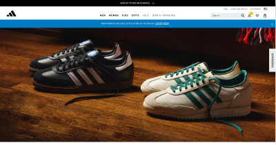
For example, you can see two pairs of sneakers in the screenshot. Although they are identical in size and shape, the image still feels unbalanced. This imbalance occurs because the image is quite dark overall: the background is dark, and the sneakers on the left side blend into the darkness as well. As a result, the right pair of sneakers appears to “weigh” more, drawing more attention.
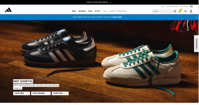
However, if we bring back the text with a white background that was there on the left before I have edited the screenshot, the perception of the image changes completely. Suddenly, the composition feels balanced. Even though the text is smaller than the pair of sneakers, its bright color gives it the right weight. By the way white strips on the black sneakers also help support the balance.
Here is an example of how balance works in art.
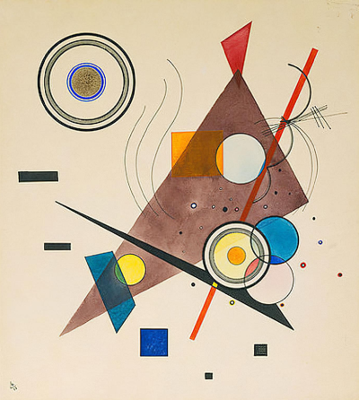
I really love examples from abstract art because it’s a place where composition is expressed through simple forms.
Pay attention to how the circles in the image below are balanced, as well as how the blue color is used to create harmony. The placement of the elements and their colors is far from random.
Chapter 2 - Symmetry and Asymmetry
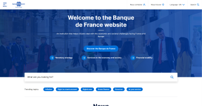
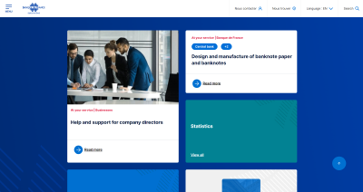
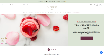
Symmetry often creates a sense of stability and order. When elements are perfectly mirrored on either side of a composition, the result feels formal and balanced. This is useful in design when you want to convey a sense of trustworthiness or professionalism, like on a homepage for a financial institution or a law firm. For example, the bank’s website shown below, which has a quite symmetrical design.
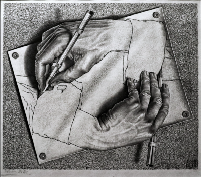
In “Drawing Hands,” Escher uses symmetry to show balance between the two hands, which are mirrored.
However, asymmetry can be just as powerful. Asymmetrical compositions introduce dynamism and interest by making one side of the composition heavier than the other, yet still balanced in a way that feels intentional. In web design, this could be used to emphasize certain elements over others, drawing the user’s attention to key calls to action.
In the screenshot below, we see large green call-to-action buttons placed asymmetrically. Also, on one side, bold, large text draws attention, while a photo on the other side provides visual weight, keeping the composition harmonious—an excellent example of asymmetry that still maintains balance.

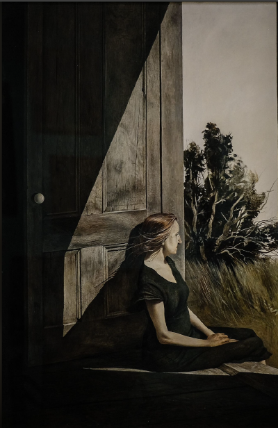
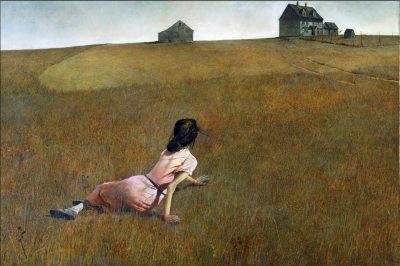
Another example from classical art: a good composition is often about the balance of light and dark areas. The painting below is a great example of an asymmetrical but well-balanced composition. It’s interesting how the large dark figure on the left is balanced by the many details on the right, like the main character’s head and hands and the detailed plants.
Chapter 3 - Static vs. Dynamic Composition
A static composition feels stable, calm, and unmoving. It might be symmetrical or organized in a way that feels grounded. In contrast, a dynamic composition, whether in art or design, has a sense of movement and energy, which can be achieved through the placement of elements, lines, and contrasting forms.
By understanding and applying these principles of composition from art, we can create web designs that are not only aesthetically pleasing but also functional and intuitive.
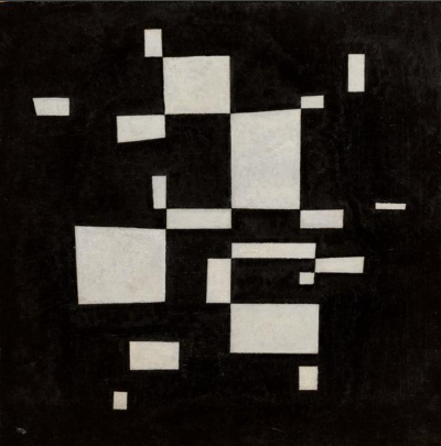
Wassily Kandinsky’s abstract composition ‘White on Black’ feels very static, even though it is asymmetrical. The square or rectangular shapes naturally create a sense of stability, and there are no diagonal elements to add movement. Such compositions often feel very calm.
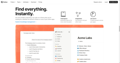
All these same techniques apply to the web design in the screenshot below. Such designs are also common for organizations where building user trust is important.
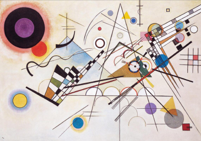
On the other hand, Wasily Kandinsky’s ‘Composition VIII’ is much more dynamic. Dynamic compositions often use diagonal lines, which you can see a lot of in this piece. Triangular shapes are also common. The different shapes and sizes of the objects create a sense of movement in the artwork.
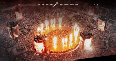
The screenshots below are from the website of the rock band Metallica. Websites like this can afford more dynamic designs. In the first screenshot, we see a dynamic photo that fills the entire screen, creating an immersive experience and making the user feel as if they are at a concert. This approach works very effectively.
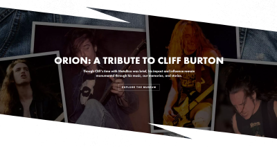
The second page is also very dynamic. It uses diagonals and triangle shapes, which create a sense of energy and movement.
Chapter 4 - Contrasts in Art and Design
Contrast is one of the most fundamental tools in both art and design. It helps draw attention to specific elements by creating visual differences between them.
So, what types of contrasts can we have?
In art, contrasts can be created through color, size, shape, texture, and tone. These contrasts are what guide the viewer’s eye and highlight the most important parts of the composition.
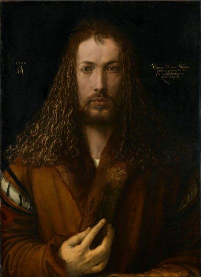
If you look at this impressive self-portrait of Albrecht Dürer and then squint, you’ll notice that the lightest part of the painting is his face. His hands are also quite light. The main focus is highlighted by the contrast of light and dark. The head is the most detailed part, creating a contrast in detail. Notice that the clothes have very few details, which helps draw attention to the face.
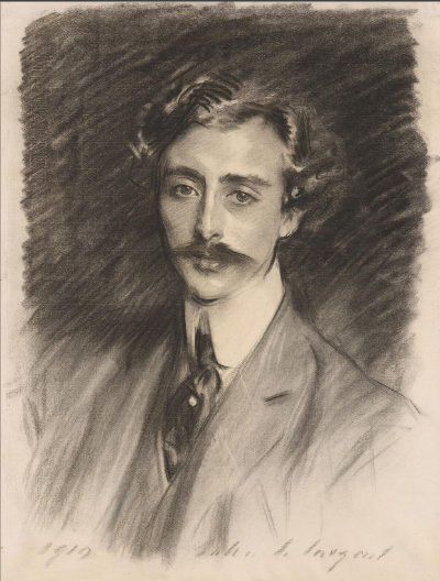
Another example is the Portrait of Ernest Schelling by Sargent. This is a sketch, and I love sketches because they use minimal tools to create maximum expression. The main focus here is very clear—the face. There aren’t many details in other areas, and the face is also one of the lightest parts of the portrait.
Now, let’s connect this to web design. In web design, the same principles of contrast are used to emphasize key elements and make the interface more intuitive. For example, if you want to direct a user’s attention to a headline, you increase the font size or make it bold. The larger, bolder text immediately stands out, drawing the user’s eye toward the title
Similarly, when adding secondary text, such as a subheading or a paragraph, it’s important not to let it compete with the primary heading. This is usually done by using a smaller or lighter font, which ensures that the primary emphasis remains on the headline.
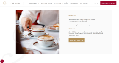
We have already analyzed one example with call-to-action buttons. Let’s look at another one. It’s clear that the first thing that catches the eye is the “RESERVE A TABLE NOW” offer — the only bright spots on a calm background. Another element that draws attention is the photo of the table itself, which helps involve the viewer. We can also see the difference in fonts between the headings and the regular text, helping to establish a hierarchy of importance for the elements.
Animation and Movement as Visual Contrast
Another way to control focus and guide a viewer’s gaze is through animation. In web design, animation creates a dynamic contrast between moving and static elements. It can be subtle, like a hover effect on a button, or more pronounced, like an animated transition between sections of a website.
Animation serves as a visual cue, signaling to the user what to focus on next. Just as in art, where a change in tone or texture can create emphasis, movement in web design is used strategically to highlight important features without overwhelming the user.
Here’s an example — our gaze is immediately drawn to the moving image.
Color Contrasts in Web Design
Contrast is not only about size and weight, but also about color. In many web designs, you’ll notice that a lot of the background space is kept neutral—either white, gray, or black—while key elements, such as buttons or calls to action, are highlighted in a contrasting color. This deliberate use of color makes important elements impossible to miss, guiding users to the action you want them to take.
Look how great the logo stands out in red in this design.
Or here, the call-to-action buttons and important headings for the user are highlighted with color.
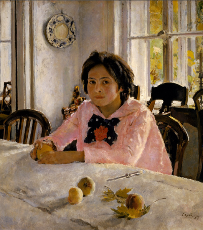
And of course, here’s an example from classical art. In the painting, the main character is highlighted with the pink color of her blouse.
Also, notice that when we introduce a color, like pink, we don’t just make one object pink. If we do, we try to create support for that color in other areas. If you look closely, you’ll notice that pink tones are subtly incorporated into the wall, otherwise, the color would look out of place and unbalanced in the painting.
Chapter 5 - Color Theory
Now, let’s touch on color theory, specifically the color wheel developed by Johannes Itten. Johannes Itten was a famous Swiss artist and educator, and his color wheel is widely referenced for understanding the relationships between colors.
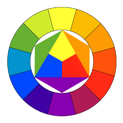
Let me explain the concept behind this color wheel. The primary colors are red, yellow, and blue. When we mix red and blue, we get purple. Mixing yellow and blue gives us green, and combining yellow and red results in orange. These are secondary colors. And all of these, including the shades in between, are represented on Itten’s color wheel.
So, how do we use the color wheel? One effective approach is to look at complementary colors, which are positioned opposite each other on the wheel. These pairings create strong visual harmony. Classic examples include green and red, purple and yellow, and orange and blue. These combinations not only create balance but are also excellent for drawing attention to specific elements in a composition.
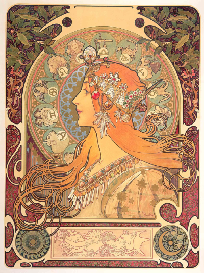
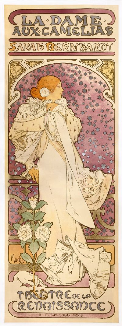
The artwork by Alphonse Mucha featured here uses green and red as the main colors, creating a combination that is both striking and harmonious.
Sargent’s study is also highly expressive, thanks to the combination of bluish-violet and yellow-orange shades, which are also positioned on opposite sides of the color wheel.
Here is an example of a website that uses the harmonious combination of green and red.
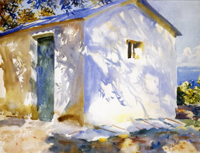
This is another case that demonstrates the expressive combination of blue and orange.
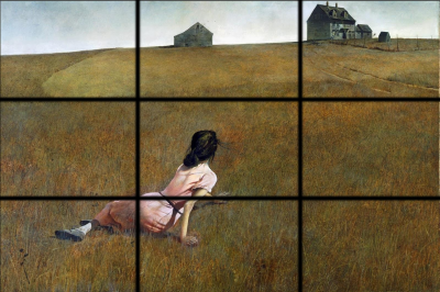
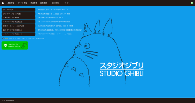
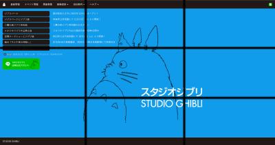
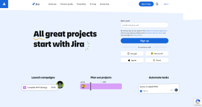
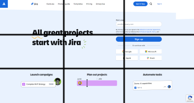
Chapter 6 - Compositional Patterns: The Rule of Thirds
One of the simplest yet most effective compositional patterns is the rule of thirds. This method is often considered a simplified version of the golden ratio. To use the rule of thirds, divide the canvas into three equal parts vertically and horizontally, creating a grid of nine sections. The intersections of these lines are the “attention centers”, where the viewer’s eye naturally gravitates first.
In both art and web design, placing key elements at these intersection points helps guide the viewer’s focus. For example, an important image placed at these points will immediately catch the user’s attention. The rule of thirds is a versatile tool that brings balance and harmony to your composition with minimal effort.
Below are several examples showcasing how this works in both art and web design.
Chapter 7 - Format and Scale
The format and scale of a composition significantly influence its overall atmosphere. Different formats create different moods and dictate how the viewer engages with the work. A wider format might feel expansive and open, while a narrow, vertical format can create a sense of height or tension.
For example, when creating a full-body portrait, artists often choose a vertical format. This helps emphasize the subject’s height and overall presence, giving a sense of elegance and proportion, as you can see in the example above.
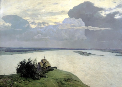
For landscapes, on the other hand, horizontal formats are more commonly chosen. Isaak Levitan’s ‘Above the Eternal Peace’ is one of my favorite works. The artist makes excellent use of the format, creating a sense of openness and vastness in the scene.
In web design, understanding the scale and format of your layout is equally important. For instance, mobile screens demand a different approach to layout than desktop screens, not just because of the size but because the user’s experience and engagement with the content change. You have to carefully consider what elements will take up space and how they will be perceived on different devices.
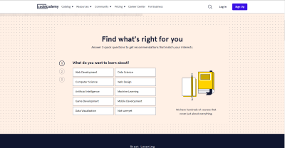
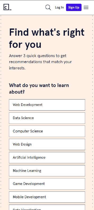
In the examples above, you can see how the layout changes for computer and mobile devices. On desktop, the design usually has more space to work with, allowing for multiple columns, image, and detailed content. However, for mobile devices, the design is simplified to ensure a smooth user experience. Elements are often stacked vertically, and text is optimized for smaller screens. This adaptation helps improve readability and accessibility on different devices.
Chapter 8 - Circular Movement
Another technique for creating dynamic and engaging compositions is the use of circular movement. This refers to compositions where the viewer’s eye is drawn in a circular path, constantly moving through the piece without leaving the frame. This creates a sense of flow and balance, keeping the viewer engaged.
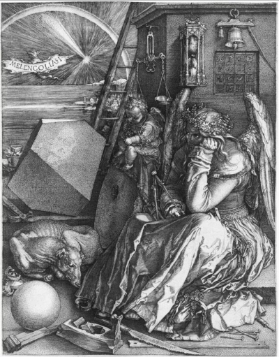
In Albrecht Dürer’s ‘Melencolia I’, all the elements of the composition are directed inward. Whether it’s the seated figure, the ladder in the background, or the dog, all these details guide the gaze around, creating an effect of endless movement and immersion in the artwork.
In web design, this can be applied by organizing elements in a way that naturally leads the user’s attention back to the main points. Round icons, curved lines, or circular layouts can subtly guide the user’s gaze, creating a harmonious experience as they interact with the content.
In the example above, we see an animation that also moves inward, rather than going beyond the screen. This also directs the gaze back inside, creating a similar effect.
Chapter 9 - Left-to-Right Movement
Another interesting aspect of how we perceive visuals relates to directional movement. For cultures that read from left to right, like in most European countries, we naturally “read” images and movement in the same way. In compositions, we tend to follow this left-to-right flow when interpreting visual content.
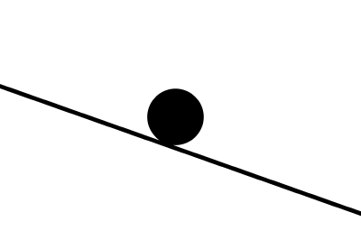
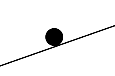
For people who are used to reading from left to right, they will likely perceive the movement of the ball from left to right in both images, unless other visual cues indicate a different direction.
This principle can be used in both art and design. For example, placing an object or character moving from left to right creates a sense of natural progression and forward momentum. On websites, this can guide users as they scroll through content, subtly steering them towards important sections. Conversely, placing movement from right to left can feel counterintuitive, sometimes evoking a sense of going backward or resisting progress.
In web design, understanding this natural flow can help you create smoother, more intuitive experiences for users. Buttons, call-to-action elements, or scrolling patterns that follow a left-to-right trajectory feel natural and are more likely to engage users effectively.

As we can see in the example, the cyclists are riding from left to right, not in the opposite direction, which would likely be perceived as unnatural by people who read from left to right.
Final Chapter - Key Advice for Artists and Designers
- Avoid “Accidents” in Your Work
Every element in your composition should be intentional. Instead of letting things happen by chance, always think through your decisions. Ask yourself: Why am I placing this element here? Why am I using this color? This level of thought ensures that every part of your design or artwork has purpose and contributes to the overall composition.
- Create Multiple Options
Don’t settle on your first idea. It’s always beneficial to explore multiple possibilities. Simple, quick sketches—taking just 5-7 minutes—can help you visualize different approaches without overcommitting to one direction. These rough drafts serve as blueprints, allowing you to refine and choose the most effective composition before diving into the final piece.
- Look at as many good examples as you can
This practice is often referred to as developing your “visual library” or improving your visual literacy. By regularly exposing yourself to high-quality designs, artworks, or layouts, you begin to internalize what works well—whether it’s balance, composition, color use, or typography. Over time, this builds your intuition and sharpens your sense of what looks good and why, helping you make better creative decisions in your own work.
- You can break any rule, as long as you understand why you’re doing it
In both art and design, rules serve as guidelines to create balance, harmony, and clarity. However, true creativity often comes from knowing when and how to break those rules intentionally. The key is understanding the principles first, so you can break them with confidence and purpose.